Objectives: Learning objectives
-
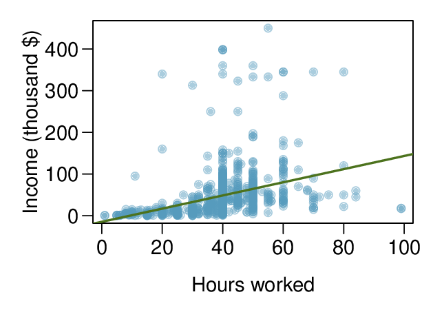
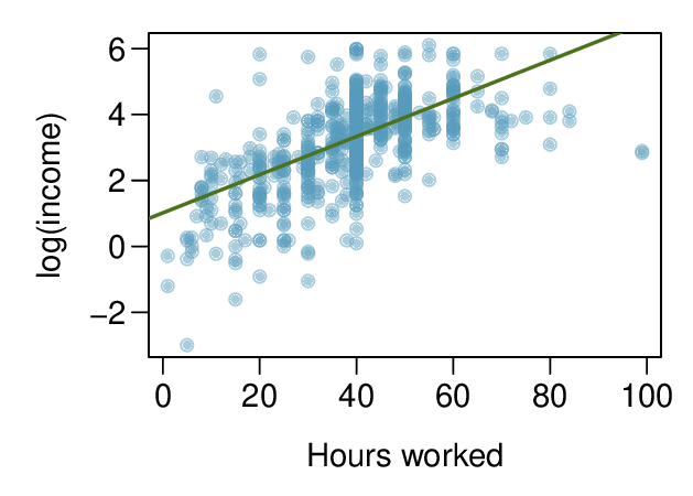
See how a log transformation can bring symmetry to an extremely skewed variable.
-
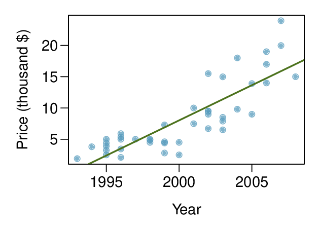
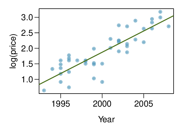
Recognize that data can often be transformed to produce a linear relationship, and that this transformation often involves log of the \(y\)-values and sometimes log of the \(x\)-values.
-
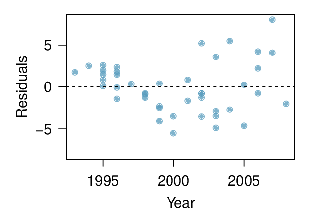
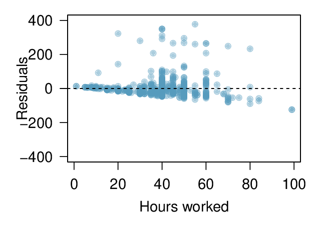
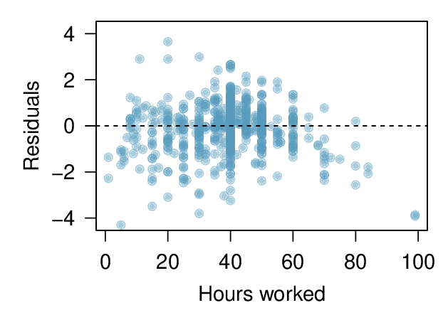
Use residual plots to assess whether a linear model for transformed data is reasonable.