
Advanced High School Statistics: Third Edition

Section 2.4 Considering categorical data

How do we visualize and summarize categorical data? In this section, we will introduce tables and other basic tools for categorical data that are used throughout this book and will answer the following questions:
  1. Based on the loan50 data, is there an assocation between the categorical variables of homeownership and application type (individual, joint)?
  2. Using the email50 data, does email type provide any useful value in classifying email as spam or not spam?

Subsection 2.4.1 Contingency tables and bar charts

Table 2.4.1 summarizes two variables: app_type and homeownership. A table that summarizes data for two categorical variables in this way is called a contingency table. Each value in the table represents the number of times a particular combination of variable outcomes occurred. For example, the value 3496 corresponds to the number of loans in the data set where the borrower rents their home and the application type was by an individual. Row and column totals are also included. The row totals provide the total counts across each row (e.g. \(3496+3839+1170=8505\)), and column totals are total counts down each column. We can also create a table that shows only the overall percentages or proportions for each combination of categories, or we can create a table for a single variable, such as the one shown in Table 2.4.2 for the homeownership variable.
Table 2.4.1. A contingency table for app_type and homeownership.
homeownership
rent mortgage own Total
app_type individual 3496 3839 1170 8505
joint 362 950 183 1495
Total 3858 4789 1353 10000
A bar chart (also called bar plot or bar graph) is a common way to display a single categorical variable. The left panel of Figure 2.4.3 shows a bar chart for the homeownership variable. In the right panel, the counts are converted into proportions, showing the proportion of observations that are in each level (e.g. \(3858/10000=0.3858\) for rent).
Table 2.4.2. A table summarizing the frequencies of each value for the homeownership variable.
homeownership Count
rent 3858
mortgage 4789
own 1353
Total 10000
Figure 2.4.3. Two bar charts of number. The left panel shows the counts, and the right panel shows the proportions in each group.

Subsection 2.4.2 Row and column proportions

Sometimes it is useful to understand the fractional breakdown of one variable in another, and we can modify our contingency table to provide such a view. Table 2.4.4 shows the row proportions for Table 2.4.1, which are computed as the counts divided by their row totals. The value 3496 at the intersection of individual and rent is replaced by \(3496/8505=0.411\text{,}\) i.e. 3496 divided by its row total, 8505. So what does 0.411 represent? It corresponds to the proportion of individual applicants who rent.
Table 2.4.4. A contingency table with row proportions for the app_type and homeownership variables. The row total is off by 0.001 for the joint row due to a rounding error.
rent mortgage own Total
individual 0.411 0.451 0.138 1.000
joint 0.242 0.635 0.122 1.000
Total 0.386 0.479 0.135 1.000
A contingency table of the column proportions is computed in a similar way, where each column proportion is computed as the count divided by the corresponding column total. Table 2.4.5 shows such a table, and here the value 0.906 indicates that 90.6% of renters applied as individuals for the loan. This rate is higher compared to loans from people with mortgages (80.2%) or who own their home (85.1%). Because these rates vary between the three levels of homeownership (rent, mortgage, own), this provides evidence that the app_type and homeownership variables are associated.
We could also have checked for an association between app_type and homeownership in Table 2.4.4 using row proportions. When comparing these row proportions, we would look down columns to see if the fraction of loans where the borrower rents, has a mortgage, or owns varied across the individual to joint application types.
Table 2.4.5. A contingency table with column proportions for the app_type and homeownership variables. The total for the last column is off by 0.001 due to a rounding error.
rent mortgage own Total
individual 0.906 0.802 0.865 0.851
joint 0.094 0.198 0.135 0.150
Total 1.000 1.000 1.000 1.000

Guided Practice 2.4.6.

  1. What does 0.451 represent in Table 2.4.4?
  2. What does 0.802 represent in Table 2.4.5?
     1 
    (a) 0.451 represents the proportion of individual applicants who have a mortgage. (b) 0.802 represents the fraction of applicants with mortgages who applied as individuals.

Guided Practice 2.4.7.

  1. What does 0.122 at the intersection of joint and own represent in Table 2.4.4?
  2. What does 0.135 represent in the Table 2.4.5?
     2 
    (a) 0.122 represents the fraction of joint borrowers who own their home. (b) 0.135 represents the home-owning borrowers who had a joint application for the loan.

Example 2.4.8.

Data scientists use statistics to filter spam from incoming email messages. By noting specific characteristics of an email, a data scientist may be able to classify some emails as spam or not spam with high accuracy. One such characteristic is whether the email contains no numbers, small numbers, or big numbers. Another characteristic is the email format, which indicates whether or not an email has any HTML content, such as bolded text. We’ll focus on email format and spam status using the email data set, and these variables are summarized in a contingency table in Table 2.4.9. Which would be more helpful to someone hoping to classify email as spam or regular email for this table: row or column proportions?
Solution.
A data scientist would be interested in how the proportion of spam changes within each email format. This corresponds to column proportions: the proportion of spam in plain text emails and the proportion of spam in HTML emails.
If we generate the column proportions, we can see that a higher fraction of plain text emails are spam (\(209/1195 = 17.5\%\)) than compared to HTML emails (\(158/2726 = 5.8\%\)). This information on its own is insufficient to classify an email as spam or not spam, as over 80% of plain text emails are not spam. Yet, when we carefully combine this information with many other characteristics, we stand a reasonable chance of being able to classify some emails as spam or not spam with confidence.
Table 2.4.9. A contingency table for spam and format.
text HTML Total
spam 209 158 367
not spam 986 2568 3554
Total 1195 2726 3921
Example 2.4.8 points out that row and column proportions are not equivalent. Before settling on one form for a table, it is important to consider each to ensure that the most useful table is constructed. However, sometimes it simply isn’t clear which, if either, is more useful.

Example 2.4.10.

Look back to Table 2.4.4 and Table 2.4.5. Are there any obvious scenarios where one might be more useful than the other?
Solution.
None that we thought were obvious! What is distinct about app_type and homeownership vs the email example is that these two variables don’t have a clear explanatory-response variable relationship that we might hypothesize (see Subsection 1.3.3 for these terms). Usually it is most useful to “condition” on the explanatory variable. For instance, in the email example, the email format was seen as a possible explanatory variable of whether the message was spam, so we would find it more interesting to compute the relative frequencies (proportions) for each email format.

Subsection 2.4.3 Using a bar chart with two variables

Contingency tables using row or column proportions are especially useful for examining how two categorical variables are related. Segmented bar charts provide a way to visualize the information in these tables.
A segmented bar chart, or stacked bar chart, is a graphical display of contingency table information. For example, a segmented bar chart representing Table 2.4.5 is shown in Figure 2.4.(a), where we have first created a bar chart using the homeownership variable and then divided each group by the levels of app_type .
One related visualization to the segmented bar chart is the side-by-side bar chart, where an example is shown in Figure 2.4.(b).
For the last type of bar chart we introduce, the column proportions for the app_type and homeownership contingency table have been translated into a standardized segmented bar chart in Figure 2.4.(c). This type of visualization is helpful in understanding the fraction of individual or joint loan applications for borrowers in each level of homeownership. Additionally, since the proportions of joint and individual vary across the groups, we can conclude that the two variables are associated.
(a)
(b)
(c)
(d)
Figure 2.4.11. (a) segmented bar chart for homeownership, where the counts have been further broken down by app_type. (b) Side-by-side bar chart for homeownership and app_type. (c) Standardized version of the segmented bar chart. (d) Standardized side-by-side bar chart. See these bar charts on Tableau Public
 3 
public.tableau.com/profile/openintro#!/vizhome/Chapter2_23/Fig2_31
.

Example 2.4.12.

Examine the four bar charts in Figure 2.4.11. When is the segmented, side-by-side, standardized segmented bar chart, or standardized side-by-side the most useful?
Solution.
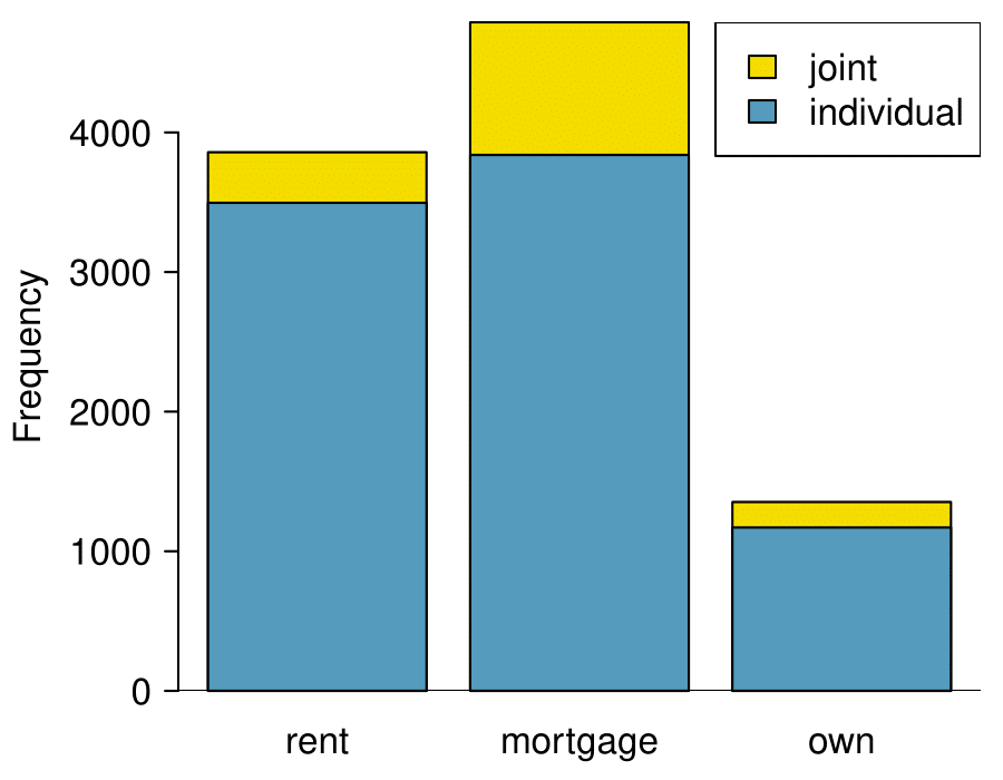
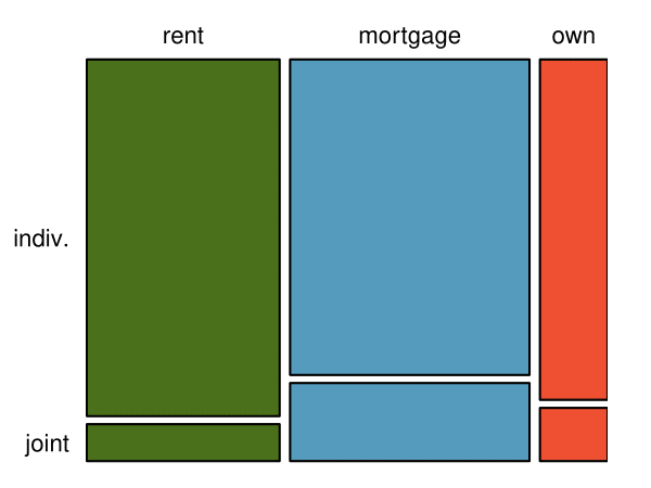
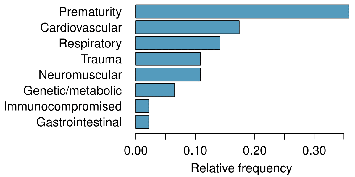
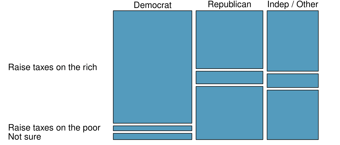
The segmented bar chart is most useful when it’s reasonable to assign one variable as the explanatory variable and the other variable as the response, since we are effectively grouping by one variable first and then breaking it down by the others.
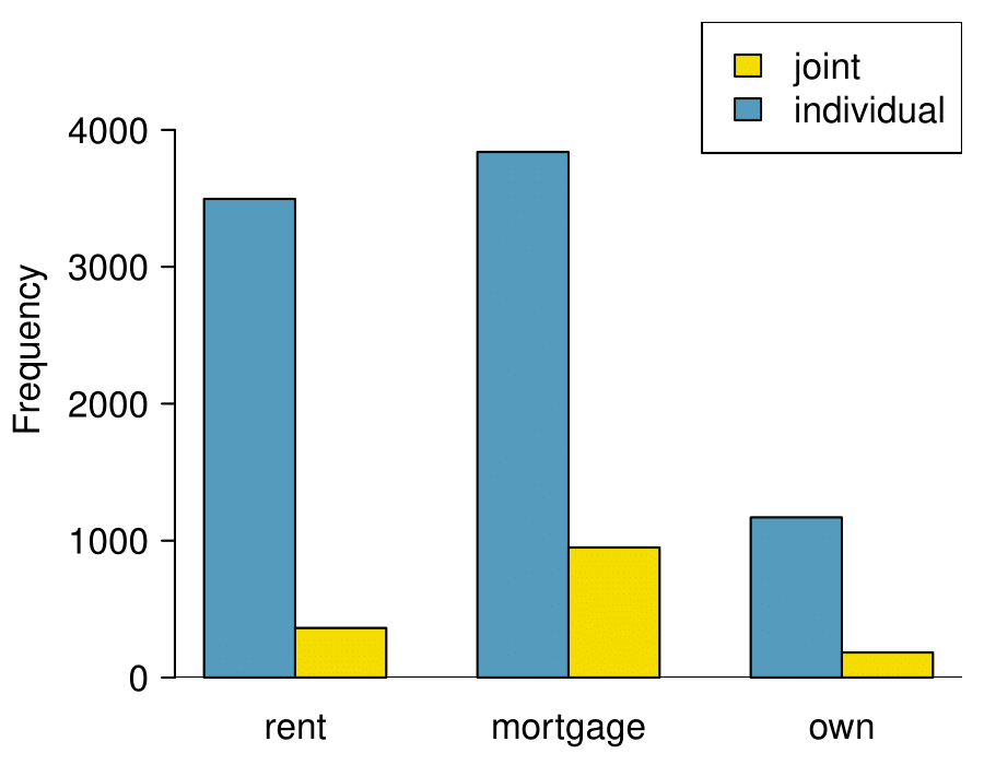
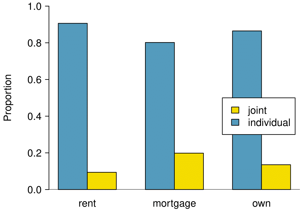
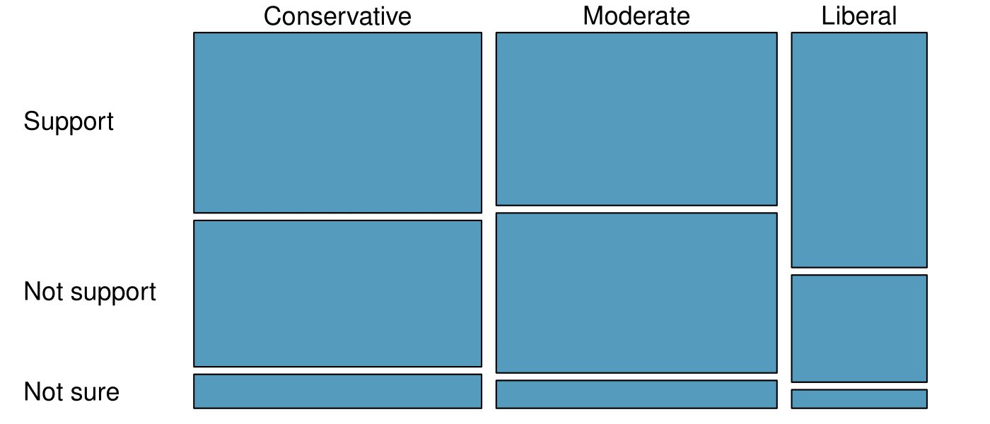
Side-by-side bar charts are more agnostic in their display about which variable, if any, represents the explanatory and which the response variable. It is also easy to discern the number of cases in of the six different group combinations. However, one downside is that it tends to require more horizontal space; the narrowness of Figure 2.4.(b) makes the plot feel a bit cramped. Additionally, when two groups are of very different sizes, as we see in the own group relative to either of the other two groups, it is difficult to discern if there is an association between the variables.
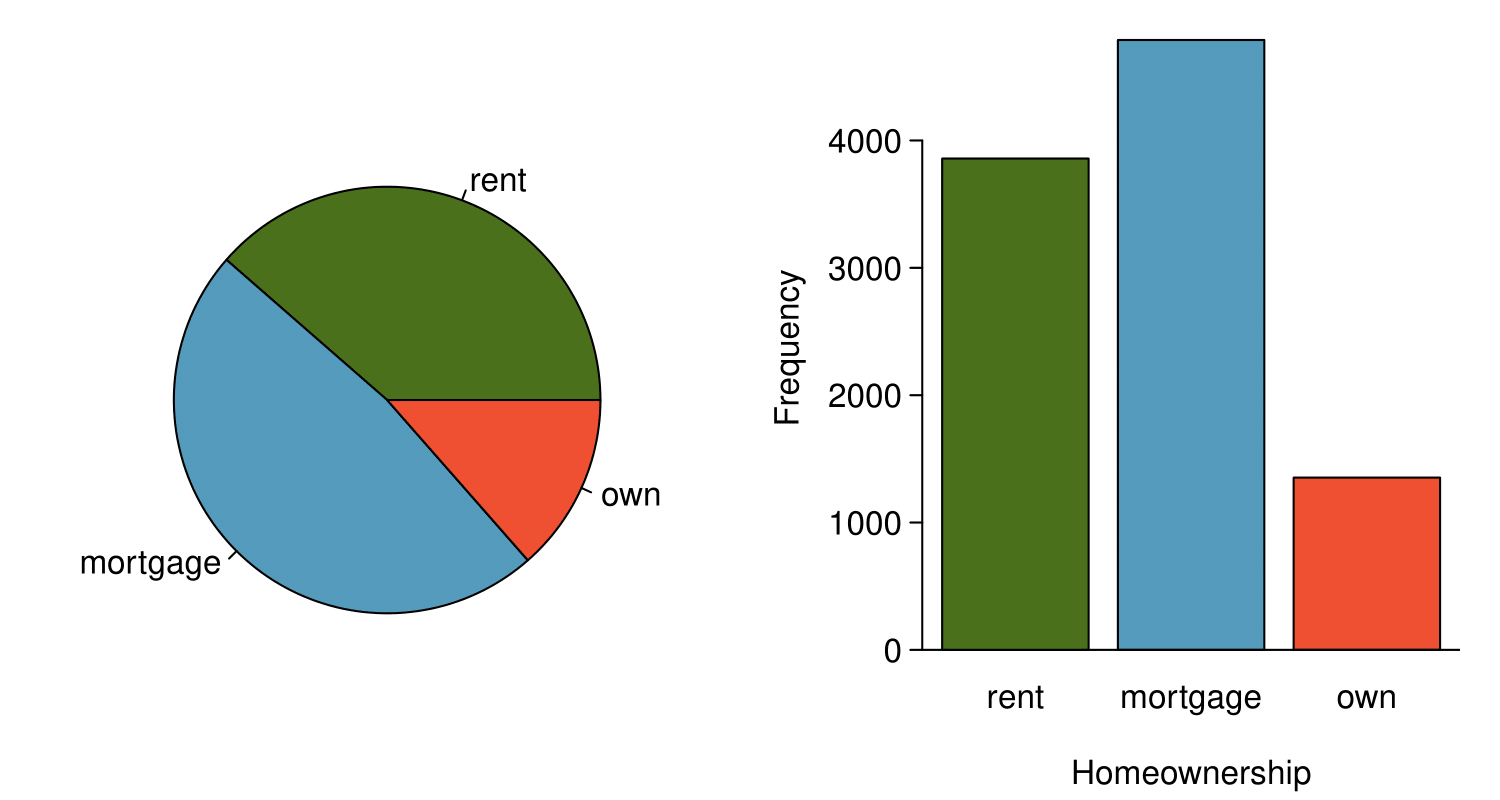
The standardized segmented bar chart is helpful if the primary variable in the segmented bar chart is relatively imbalanced, e.g. the own category has only a third of the observations in the 
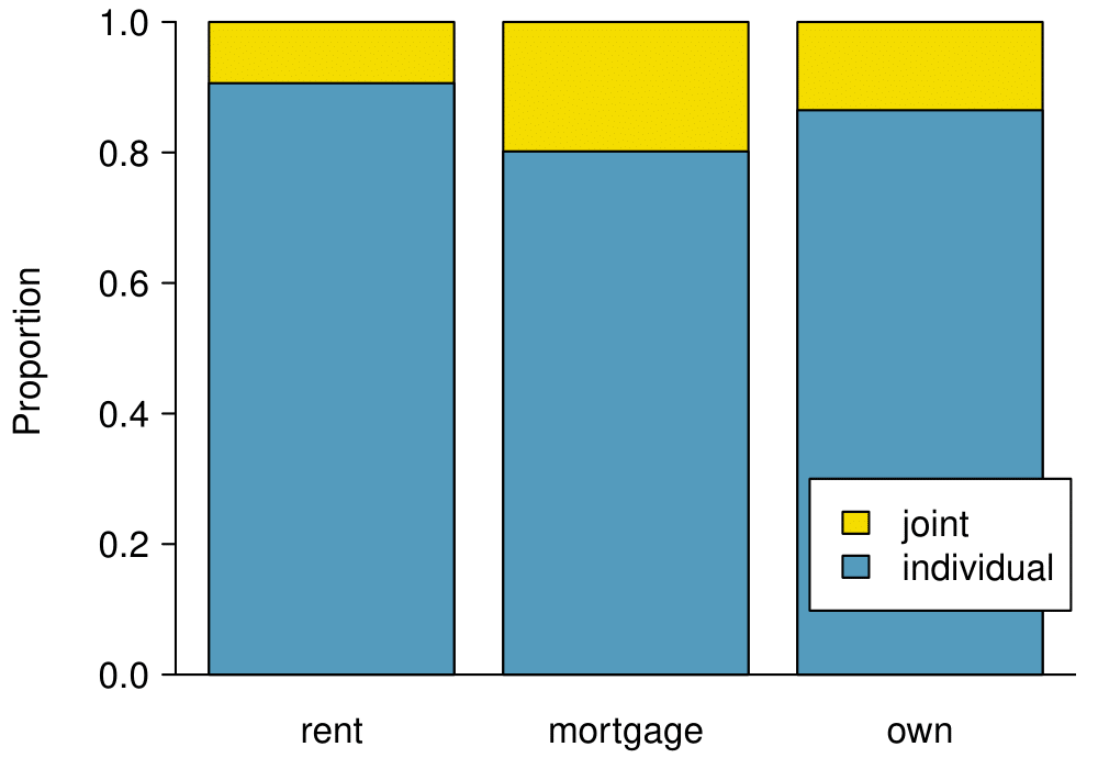
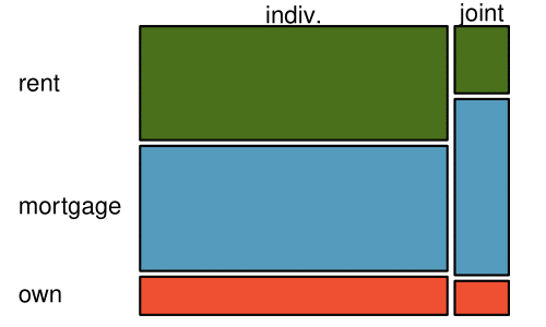
mortgage category, making the simple segmented bar chart less useful for checking for an association. The major downside of the standardized version is that we lose all sense of how many cases each of the bars represents.
The last plot is a standardized side-by-side bar chart. It shows the joint and individual groups as proportions within each level of homeownership, and it offers similar benefits and tradeoffs to the standardized version of the stacked bar plot.

Subsection 2.4.4 Mosaic plots

A mosaic plot is a visualization technique suitable for contingency tables that resembles a standardized segmented bar chart with the benefit that we still see the relative group sizes of the primary variable as well.
To get started in creating our first mosaic plot, we’ll break a square into columns for each category of the homeownership variable, with the result shown in Figure 2.4.13.(a). Each column represents a level of homeownership, and the column widths correspond to the proportion of loans in each of those categories. For instance, there are fewer loans where the borrower is an owner than where the borrower has a mortgage. In general, mosaic plots use box areas to represent the number of cases in each category.
(a)
(b)
Figure 2.4.13. (a) The one-variable mosaic plot for homeownership. (b) Two-variable mosaic plot for both homeownership and app_type.
To create a completed mosaic plot, the single-variable mosaic plot is further divided into pieces in Figure 2.4.13.(b) using the app_type variable. Each column is split proportional to the number of loans from individual and joint borrowers. For example, the second column represents loans where the borrower has a mortgage, and it was divided into individual loans (upper) and joint loans (lower). As another example, the bottom segment of the third column represents loans where the borrower owns their home and applied jointly, while the upper segment of this column represents borrowers who are homeowners and filed individually. We can again use this plot to see that the homeownership and app_type variables are associated, since some columns are divided in different vertical locations than others, which was the same technique used for checking an association in the standardized segmented bar chart.
In Figure 2.4.14, we chose to first split by the homeowner status of the borrower. However, we could have instead first split by the application type, as in Figure 2.4.14. Like with the bar charts, it’s common to use the explanatory variable to represent the first split in a mosaic plot, and then for the response to break up each level of the explanatory variable, if these labels are reasonable to attach to the variables under consideration.
Figure 2.4.14. Mosaic plot where loans are grouped by the homeownership variable after they’ve been divided into the individual and joint application types.

Subsection 2.4.5 The only pie chart you will see in this book

A pie chart is shown in Figure 2.4.15 alongside a bar chart representing the same information. Pie charts can be useful for giving a high-level overview to show how a set of cases break down. However, it is also difficult to decipher details in a pie chart. For example, it takes a couple seconds longer to recognize that there are more loans where the borrower has a mortgage than rent when looking at the pie chart, while this detail is very obvious in the bar chart. While pie charts can be useful, we prefer bar charts for their ease in comparing groups.
Figure 2.4.15. A pie chart and bar chart of homeownership. Compare multiple ways of summarizing a single categorical variable on Tableau Public.

Subsection 2.4.6 Section summary

  • Categorical variables, unlike numerical variables, are simply summarized by counts (how many) and proportions. These are referred to as frequency and relative frequency, respectively.
  • When summarizing one categorical variable, a one-way frequency table is useful. For summarizing two categorical variables and their relationship, use a two-way frequency table (also known as a contingency table).
  • To graphically summarize a single categorical variable, use a bar chart. To summarize and compare two categorical variables, use a side-by-side bar chart, a segmented bar chart, or a mosaic plot.
  • Pie charts are another option for summarizing categorical data, but they are more difficult to read and bar charts are generally a better option.

Exercises 2.4.7 Exercises

1. Antibiotic use in children.

The bar plot and the pie chart below show the distribution of pre-existing medical conditions of children involved in a study on the optimal duration of antibiotic use in treatment of tracheitis, which is an upper respiratory infection.
  1. What features are apparent in the bar plot but not in the pie chart?
  2. What features are apparent in the pie chart but not in the bar plot?
  3. Which graph would you prefer to use for displaying these categorical data?
Solution.
  1. We see the order of the categories and the relative frequencies in the bar plot.
  2. There are no features that are apparent in the pie chart but not in the bar plot.
  3. We usually prefer to use a bar plot as we can also see the relative frequencies of the categories in this graph.

2. Views on immigration.

910 randomly sampled registered voters from Tampa, FL were asked if they thought workers who have illegally entered the US should be (i) allowed to keep their jobs and apply for US citizenship, (ii) allowed to keep their jobs as temporary guest workers but not allowed to apply for US citizenship, or (iii) lose their jobs and have to leave the country. The results of the survey by political ideology are shown below.
 4 
SurveyUSA, News Poll #18927, data collected Jan 27-29, 2012.
Political ideology
Conservative Moderate Liberal Total
Response (i) Apply for citizenship 57 120 101 278
(ii) Guest worker 121 113 28 262
(iii) Leave the country 179 126 45 350
(iv) Not sure 15 4 1 20
Total 372 363 175 910
  1. What percent of these Tampa, FL voters identify themselves as conservatives?
  2. What percent of these Tampa, FL voters are in favor of the citizenship option?
  3. What percent of these Tampa, FL voters identify themselves as conservatives and are in favor of the citizenship option?
  4. What percent of these Tampa, FL voters who identify themselves as conservatives are also in favor of the citizenship option? What percent of moderates share this view? What percent of liberals share this view?
  5. Do political ideology and views on immigration appear to be independent? Explain your reasoning.

3. Views on the DREAM Act.

A random sample of registered voters from Tampa, FL were asked if they support the DREAM Act, a proposed law which would provide a path to citizenship for people brought illegally to the US as children. The survey also collected information on the political ideology of the respondents. Based on the mosaic plot shown below, do views on the DREAM Act and political ideology appear to be independent? Explain your reasoning.
 5 
SurveyUSA, News Poll #18927, data collected Jan 27-29, 2012.
Solution.
The vertical locations at which the ideological groups break into the Yes, No, and Not Sure categories differ, which indicates that likelihood of supporting the DREAM act varies by political ideology. This suggests that the two variables may be dependent.

4. Raise taxes.

A random sample of registered voters nationally were asked whether they think it’s better to raise taxes on the rich or raise taxes on the poor. The survey also collected information on the political party affiliation of the respondents. Based on the mosaic plot shown below, do views on raising taxes and political affiliation appear to be independent? Explain your reasoning.
 6 
Public Policy Polling, Americans on College Degrees, Classic Literature, the Seasons, and More, data collected Feb 20-22, 2015.
You have attempted of activities on this page.