Section 10.3 Getting and Exploring the Data in R
The data is available from OzDasl, a website which provides public domain data sets for analysis, and the MCG attendance data has its own page at http://www.statsci.org/data/oz/afl.html.
The variable of interest is MCG attendance, and named ’MCG’ in the dataset. Most statisticians would refer to this variable as the dependent variable, because it is the variable that we are most interested in predicting: It is the "outcome" of the situation we are trying to understand. Potential explanatory, or independent, variables include club membership, weather on match day, date of match, etc. There is a detailed description of each of the variables available on the website. You can use the data set to test your own theories of what makes football fans decide whether or not to go to a game, but to learn some of the skills we will test a couple of those factors together.
Before we can start, we need R to be able to find the data. Make sure that you download the data to the spot on your computer that R considers the "working" directory. Use the getwd() command to find out what the current working directory is:
> getwd()
After downloading the data set from OzDasl into your R working directory, read the data set into R as follows:
We include the optional ’header = TRUE’ to designate the first row as the column names, and the ’attach’ commands turns each of the named columns into a single column vector.
Once we’ve read the data into R, we can examine some plots of the data. With many techniques in data science, it can be quite valuable to visualize the data before undertaking a more detailed analysis. One of the variables we might consider is the combined membership of the two teams playing, a proxy for the popularity of the teams playing.
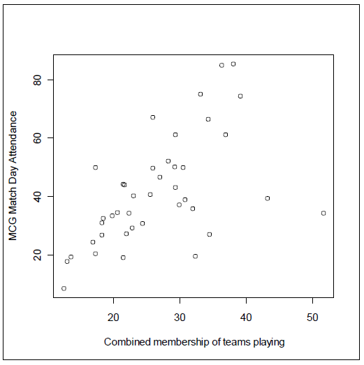
We see evidence of a trend in the points on the left hand side of the graph, and a small group of points representing games with very high combined membership but that don’t seem to fit the trend applying to the rest of data. If it wasn’t for the four "outliers" on the right hand side of the plot, we would be left with a plot showing a very strong relationship.
You have attempted of activities on this page.
