Section 6.5 Understanding Data Distributions
There are lots of other distribution shapes. The most common one that almost everyone has heard of is sometimes called the "bell" curve because it is shaped like a bell. The technical name for this is the normal distribution. The term "normal" was first introduced by Carl Friedrich Gauss (1777-1855), who supposedly called it that in a belief that it was the most typical distribution of data that one might find in natural phenomena. The following histogram depicts the typical bell shape of the normal distribution.
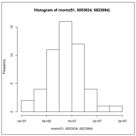
Histogram of rnorm(51, 6053834, 6823984)
If you are curious, you might be wondering how R generated the histogram above, and, if you are alert, you might notice that the histogram that appears above has the word "rnorm" in a couple of places. Here’s another of the cool features in R: it is incredibly easy to generate "fake" data to work with when solving problems or giving demonstrations. The data in this histogram were generated by R’s rnorm() function, which generates a random data set that fits the normal distribution (more closely if you generate a lot of data, less closely if you only have a little). Some further explanation of the rnorm() command will make sense if you remember that the state population data we were using had a mean of 6,053,834 and a standard deviation of 6,823,984. The command used to generate this histogram was:
hist(rnorm(51, 6043834, 6823984))
There are two very important new concepts introduced here. The first is a nested function call: The
hist() function that generates the graph "surrounds" the rnorm() function that generates the new fake data. (Pay close attention to the parentheses!) The inside function, rnorm(), is run by R first, with the results of that sent directly and immediately into the hist() function.
The other important thing is the "arguments that" were "passed" to the
rnorm() function. "Argument" is a term used by computer scientists to refer to some extra information that is sent to a function to help it know how to do its job. In this case we passed three arguments to rnorm() that it was expecting in this order: the number of observations to generate in the fake dataset, the mean of the distribution, and the standard deviation of the distribution. The rnorm() function used these three numbers to generate 51 random data points that, roughly speaking, fit the normal distribution. So the data shown in the histogram above are an approximation of what the distribution of state populations might look like if, instead of being reverse-J-shaped (Pareto distribution), they were normally distributed.
The normal distribution is used extensively through applied statistics as a tool for making comparisons. For example, look at the rightmost bar in the previous histogram. The label just to the right of that bar is 3e+07, or 30,000,000. We already know from our real state population data that there is only one actual state with a population in excess of 30 million (if you didn’t look it up, it is California). So if all of a sudden, someone mentioned to you that he or she lived in a state, other than California, that had 30 million people, you would automatically think to yourself, "Wow, that’s unusual and I’m not sure I believe it." And the reason that you found it hard to believe was that you had a distribution to compare it to. Not only did that distribution have a characteristic shape (for example, J-shaped, or bell shaped, or some other shape), it also had a center point, which was the mean, and a "spread," which in this case was the standard deviation. Armed with those three pieces of information, the type/shape of distribution, an anchoring point, and a spread (also known as the amount of variability), you have a powerful tool for making comparisons.
In the next chapter we will conduct some of these comparisons to see what we can infer about the ways things are in general, based on just a subset of available data, or what statisticians call a sample.
You have attempted of activities on this page.
