Section 15.3 GUI Widgets
As we discussed in the introduction, a GUI program allows a user to interact with a computer program using a pointing device that manipulates small pictures called
icons or widgets. The first task of a GUI program is to create the widgets needed for a program’s interface. Each widget is designed for specific purposes and your program will be more user friendly if you use each widget according to its intended purpose.
Widgets are basically images on a computer screen and they have a “look-and-feel” depending on the details of how the image is drawn. The “look-and-feel” of a widget is typically controlled by the operating system. For example, GUI programs on a Macintosh computer typically look different from programs on a Microsoft Windows computer. The
tkinter module implements two versions of widgets: one is “generic,” which makes widgets look the same regardless of what computer your program is running on, and the other implements widgets that emulate a computer’s “look-and-feel”. How you import the tkinter module determines which widgets are defined. Using the import statements shown below, the standard convention uses the name tk to access the “generic” widgets and the name ttk to access the stylized, “look-and-feel” widgets. You always need to import the tk functionality because that allows you to create an application window. You can import the ttk functionality if you want “look-and-feel” widgets. You can inter-mix the tk and ttk widgets in an interface if you so choose.
# To use the "generic" widgets
import tkinter as tk

# To use the stylized, "look-and-feel" widgets
from tkinter import ttk
The following two charts list the standard, pre-defined widgets in the
tkinter module.
The following widgets are used for user input. In some cases you have a choice between the
tk and ttk versions. In other cases you must use the tk version because the equivalent ttk versions don’t exist.
| Widget | Purpose |
|---|---|
tk.Button, ttk.Button
|
Execute a specific task; a “do this now” command. |
tk.Menu |
Implements toplevel, pulldown, and popup menus. |
ttk.Menubutton |
Displays popup or pulldown menu items when activated. |
tk.OptionMenu |
Creates a popup menu, and a button to display it. |
tk.Entry, ttk.Entry
|
Enter one line of text. |
tk.Text |
Display and edit formatted text, possibly with multiple lines. |
tk.Checkbutton, ttk.Checkbutton
|
Set on-off, True-False selections. |
tk.Radiobutton, ttk.Radiobutton
|
Allow one-of-many selections. |
tk.Listbox |
Choose one or more alternatives from a list. |
ttk.Combobox |
Combines a text field with a pop-down list of values. |
tk.Scale, ttk.Scale
|
Select a numerical value by moving a “slider” along a scale. |
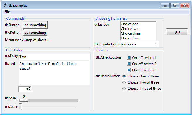
The following figure shows examples of these widgets. You can download and run this python program, all_user_input_widgets.py, to interact with the widgets.

The following
widgets display information to a user, but have no user interaction:
| Widget | Purpose |
|---|---|
tk.Label, ttk.Label
|
Display static text or an image. |
tk.Message |
Display static multi-line text. |
ttk.Separator |
Displays a horizontal or vertical separator bar. |
ttk.Progressbar |
Shows the status of a long-running operation. |
ttk.Treeview |
Displays a hierarchical collection of items. |
You do not need to memorize the above lists, but you should probably re-read the lists again so that you are familiar with what is possible in a TKinter GUI interface. (Note that the TKinter module is customizable, which means that you can create your own widgets, but that is beyond what we will study in these lessons.)
You have attempted of activities on this page.
