
7.3. Visualizing Data
Time Estimate: 45 minutes
7.3.1. Introduction and Goals
In lesson 7.2 Big Data, we investigated large data sets and how to process them. In this lesson, we will create our own data visualizations using charts in Google Sheets and maps using Google My Maps.
- describe what information can be extracted from data and metadata
- identify how a visualization can be used to mislead the audience about its underlying data
- use software to create visualizations
- explain insights and knowledge gained from programs and visualizations that process data
- use target vocabulary, such as data, metadata, and correlation while interpreting and creating visualizations, with the support of concept definitions from this lesson
7.3.2. Learning Activities
Activity 1: Interpret Data Visualizations
Working with a partner, explore the following visualization(or another visualization that your teacher suggests) and answer the following questions.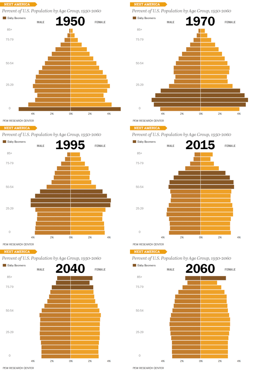
- What is the data shown in this visualization?
- What type of data is used — text, numbers, geocodes, date and time, etc.?
- What conclusions can you draw from the data?
- How is the data presented in the visualization that makes it easy to understand and use?
- What are the drawbacks of this visualization?
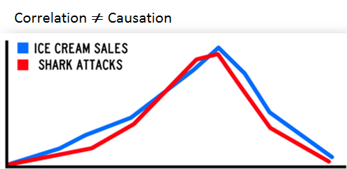
Watch and discuss the TED-Ed video below on how data can also be manipulated in data visualizations.
Activity 2: Google Sheets
Programs such as spreadsheets can be used in an iterative and interactive way to gain insight and knowledge from data. A spreadsheet is a document where the data is arranged in rows and columns. Spreadsheets allow formulas to be used to make calculations from the data and charting capabilities. Spreadsheet programs can also be used to filter and clean digital data. We will be using Google Sheets in Google Drive as our spreadsheet software in the following project.
- Open and copy the Astraptes Butterflies data set into your Google Drive. Your instructor may ask you to do File/Move to move the file to a certain folder on your drive or to Share it.
- This data set shows butterfly specimens captured and tagged in the Guanacaste National Park in Costa Rica. Look through the data and notice that the first column (herbivore species) is the species of each butterfly that was tagged. The last columns show the latitude and longitude where each butterfly was tagged. The first row is metadata that describes the data in each column. Metadata is data about data. It can be associated with the primary data, and changes and deletions made to metadata do not change the primary data. Metadata allows data to be structured and organized and is used for finding, organizing and managing information. Metadata can increase the effective use of data or data sets by providing additional information about various aspects of that data.
-
 Formulas and Functions. Each box in the spreadsheet is called a cell. Every cell in the spreadsheet is identifiable by its column letter and row number. For example, cell A2 refers to the box at column A and row 2 below and contains the data Astraptes SENNOV which is a butterfly species.
We can manipulate numeric data in a spreadsheet by using formulas and functions built into the spreadsheet software. Typing in a = in a cell signals the start of a formula like =K2 + K3 or a function like =SUM(K2,K3). These functions can take a list of cells or a range of cells such as K2:K4 which is equivalent to the list K2, K3, K4. There are many built-in functions in standard spreadsheet software, but the most commonly used ones are SUM, AVERAGE, COUNT, MAX, and MIN. Here is a tutorial that reviews how to use functions in Google Sheets.
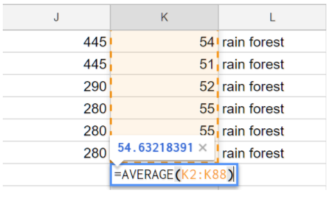
Let’s use a formula to calculate the average wingspan of the butterflies in our spreadsheet. Column K contains the wingspan measurement of each butterfly.- Scroll down to the empty cell K89 (column K, row 89).
- Type in the formula:
=AVERAGE(K2:K88) like below. This will average the data in column K rows 2-88. You could select the data that you want instead of typing in the cell numbers. When you hit enter, it will compute the average 54.63 (you can control the precision with the precision buttons in the toolbar at the top).
- (Portfolio) Write another formula that calculates the average elevation for this data. Write your formula and the result found in your portfolio.
 Sort and Filter:
You can sort and filter columns to find information and extract patterns from the data. To sort by species, click on the A at the top of column A to select the column, and then from the Data menu (or the drop down menu on column A), choose Sort. To undo the sort, select Edit/Undo.
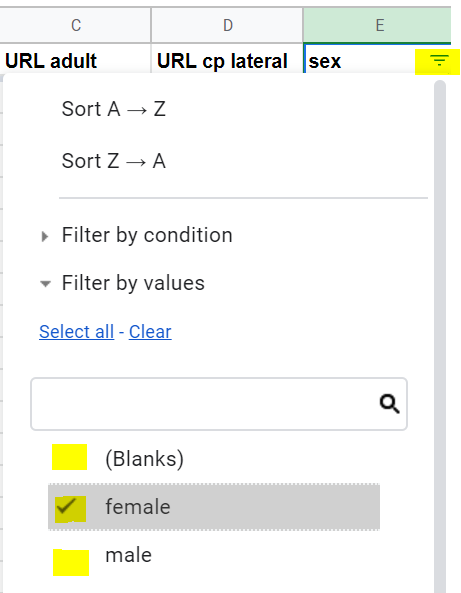
You can also filter data to show only the data you need. Click on column E or any column that you want to filter, and then click on Data/Create a Filter or the filter funnel icon
 to turn on filtering. Click on the filter icon created in cell E1 and uncheck Blanks and male, to leave just the female values. Click on OK to see the filtered data. Turn off filtering by clicking on the filter funnel icon or from the Data menu to go back to seeing all the data.
To help, here’s a sorting and filtering tutorial.
- Charts: Let’s make a chart to visualize some of the data in this spreadsheet.
- Click on the A heading in the first column (herbivore species).
- From the Insert menu at the top, select Chart. You will see a bar chart of the different species found in column A.
- Investigate the many chart options available. Try a pie chart like below. Here’s more information about different charts in Google Sheets and a tutorial on comparing charts.
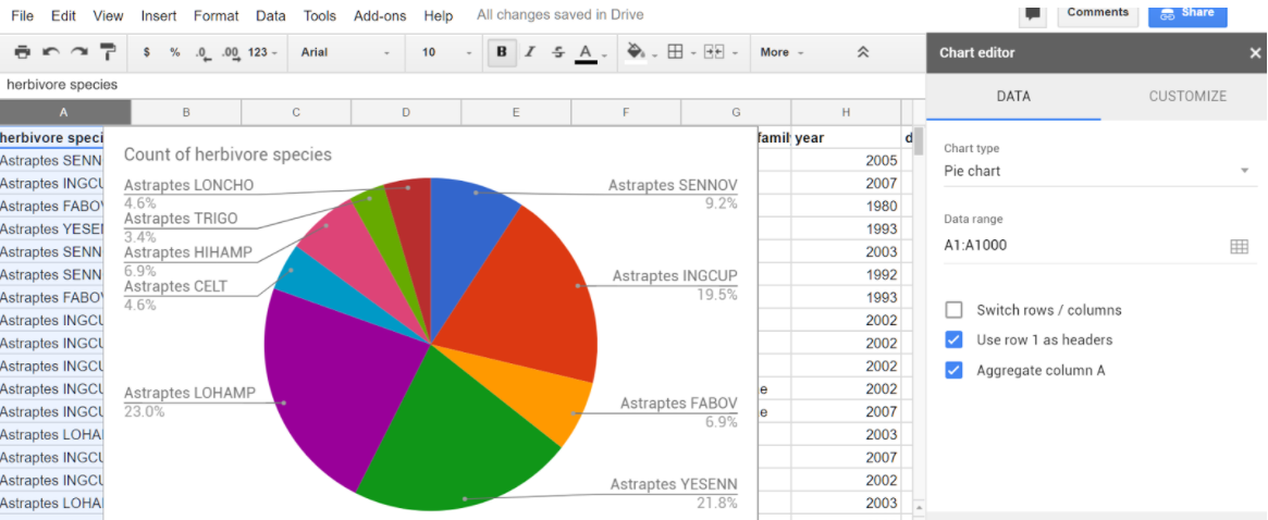
- The chart can help us answer questions such as which species is the most common?
- Once you are finished designing your chart, you can click on the dots in the top right corner of the chart to copy the image or move it to its own sheet.
- Make new charts to answer the following questions:
- (Portfolio) Are there more male or female butterflies in this data set? Include a screenshot of your chart in your portfolio to answer this question. What kind of data is in your chart?
- (Portfolio) Which ecological environment (primary eco column) do these butterflies like to live in? There is no clear winner in this question so give the percentages in each ecological environment in a screenshot of your chart and describe the data in your portfolio.
- (Portfolio) Come up with a 3rd question and use charting to answer it. Include a screenshot of your chart in your portfolio to answer this question. What kind of data is in your chart?
Activity 3: Google Maps
The last columns in the spreadsheet contain location data, latitudes and longitude in which the butterflies were found. We can map this data using Google My Maps. For troubleshooting in this activity, refer to the Google My Maps Help Center- Go to http://www.google.com/mymaps and click on the Create A New Map button. The created map will be saved in your Google Drive.
- Change the Untitled Map heading to a title like Butterflies Map and click on the blue Import button.
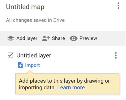
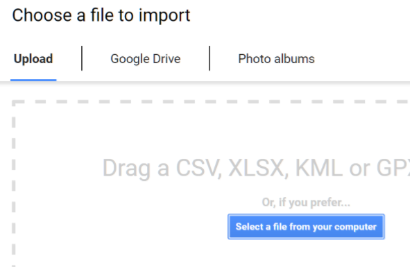
- Click on Google Drive and find your spreadsheet.
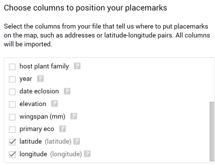
- Scroll down to select the Latitude and Longitude columns.
- Pick the herbivore species column as the title for the placemarks.
Google maps will place your data set as markers on the map. Click on some of the markers to see your data. Click on the paint roller icon to group places by herbivore species or by another column like primary eco and add labels from one of the columns, and click on the paintcan to choose different icons.
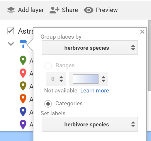
- Click on Share to share your map with your teacher or to change the settings to anyone with the link can view.
- (Portfolio) Copy the link to your portfolio. Click on Preview to grab a screenshot of your map to put in your portfolio.
7.3.3. Summary
In this lesson, you learned how to:
7.3.4. Still Curious?
These Visualizer Data Sets allow you to create visualizations of their data sets with different types of graphs.
7.3.5. Self-Check
Sample AP CSP Exam Question
- The time
- The date
- The location of the animal
- Approximately how many miles did the animal travel in one week?
- Does the animal travel in groups with other tracked animals?
- Do the movement patterns of the animal vary according to the weather?
- This is correct.
- In what geographic locations does the animal typically travel?
Q-2:
Biologists often attach tracking collars to wild animals. For each animal, the following geolocation data is collected at frequent intervals.
Which of the following questions about a particular animal could NOT be answered using only the data collected from the tracking collars?
7.3.6. Reflection: For Your Portfolio
Answer the following portfolio reflection questions as directed by your instructor. Questions are also available in this Google Doc where you may use File/Make a Copy to make your own editable copy.