Joining Data
You might often find yourself in a situation where the data you need isn’t all in the same table. While the previous examples have all been a single sheet, sometimes the variables you want to compare are in several different sheets or files. In order to analyze the relationships between these variables, first you need to bring them together.
Example: Grocery List
Suppose you have a file with two sheets: a grocery list, and a list of prices of various items. The grocery list contains the items you need and the quantity. The prices list has various items available at the grocery store and their cost. To calculate the total cost for this grocery trip, you need to join the cost information to the grocery list information. While you could copy the cost of each item over, that would be both tedious and error prone.
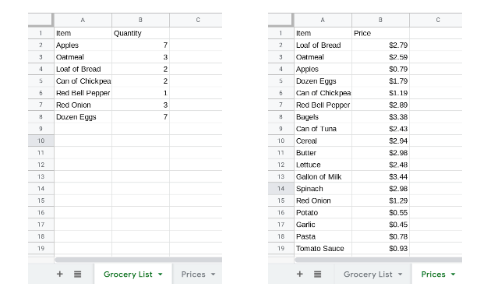
Thankfully, there is a function in Sheets that can do this work automatically.
The VLOOKUP function matches elements from one list to the corresponding values in another. You will use this to add the cost of each item in your grocery list. VLOOKUP takes four values as input: search_key, range, index, and is_sorted.
The search_key is the value VLOOKUP will try to match. For apples, the search_key will be A2 which contains the text “Apples”.
The range is a table, either in the same sheet or in another sheet in the same file, where VLOOKUP will look for the search_key. In this case, the table will be in the Prices sheet, in the cells A1:B21. To point sheets to another sheet you can either navigate to that sheet and select the area with a mouse, or type Prices!A1:B21. The exclamation point separates the name of the sheet from the location of the cells. (Note: For VLOOKUP to work properly, the seach_key terms have to be in the first column of the range.)
The index is the number of the column where the output is stored. To add the price of each item, VLOOKUP needs to return the price, which is in the second column. So in this example, the index is 2.
There are only two options for is_sorted. If the first column of the range is sorted alphabetically or numerically, then is_sorted should be True (you could also omit is_sorted, as the default value is True). If the first column of the range is not sorted, is_sorted must be False. The list of items in the Prices sheet is not in order, so is_sorted should be False in this example.

In this example, VLOOKUP finds that the price of an apple is $0.79. Try copying the formula down to the cells C3:C8.
They aren’t listed in the Prices tab.
-
Incorrect: While that can cause a similar error, both items are listed in the Prices tab.
They aren’t spelled correctly.
-
Incorrect: While that can cause a similar error, both items are spelled correctly.
The formula changed when it was copied.
-
Correct: The range changed when the formula was copied down. Rather than change it by hand in each cell, this is a great time to use absolute references.
Those have to be looked up by hand.
-
Incorrect: You want to avoid that as much as possible. It is tedious and error prone.
Q-1: Why does VLOOKUP not work for Loaf of Bread and Dozen Eggs?
Finish the grocery list by completing the following:
Correct the formula so that the Grocery List sheet has the prices for each item.
Multiply the cost per item by the number needed.
Sum the costs of for each item to get the total cost of the grocery list.
$40.55
-
Correct: The total is $40.55.
$13.33
-
Incorrect: Remember to multiply the price by the quantity.
$93.31
-
Incorrect: Make sure the prices are being multiplied by the correct quantity.
$20.23
-
Incorrect: Remember to sum all of the costs.
Q-2: What is the total for all the items on this grocery list in the quantities given?
While you could have filled these in by hand, imagine filling that information out for a grocery list with 100 items. That method is also more error prone. Another benefit to using VLOOKUP is that, if the price changes, you can update the prices tab and the subtotal will automatically be recalculated.
To get a sense of how easy it is to recalculate the total in Sheets when a single item’s price changes, answer the following question:
$37.75
-
Correct: The total is $37.75.
$15.77
-
Incorrect: Change the price of apples in the Prices sheet.
$32.64
-
Incorrect: Change the price of apples in the Prices sheet.
$25.22
-
Incorrect: Change the price of apples in the Prices sheet.
Q-3: If apples are on sale for 39 cents each, what would the new subtotal be?
Example: Death Rate by State
Earlier, you considered a non-profit that works to improve the life expectancy of Americans, and you helped them find the leading causes of deaths in the USA. Now your nonprofit wants to know how each state stacks up against the others, in terms of causes of death. For example, are some states heart-healthier than others?
To begin to answer these questions, first make a pivot table and a bar chart to tell you which states have the most deaths.
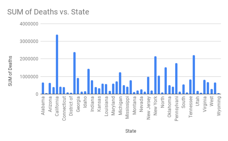
The bar chart above shows the number of deaths for each state. Not every state name is labelled, but the four tallest bars correspond to California, Florida, New York and Texas. However, just looking at raw numbers may be misleading: a state might have more deaths just because it has a large population. To compare states relatively instead of absolutely, you need to convert the values to the percentage of people who died in each state. This percentage, called the death rate, is the result of dividing the number of deaths in the state by the state population for a specific year.
The state_population.csv file has the population of each state from 2010 to 2018. Copy that sheet into a new sheet in your NCHS file. To calculate the death rate, you must specify a year so that the population of that year can be matched to the deaths from that year. To match the table of deaths to the year selected, add another filter to the pivot table of deaths by state restricting to the year 2010.

Add a column, using VLOOKUP, to display the state population in column C next to the death total for each state. The search_key will be the state name, the range will be the table of state populations, the index will be 2 because the 2010 populations are in the second column, and is_sorted will be True as the state names are in alphabetical order.

After filling in the column of state populations, add a column for the death rate by dividing the total number of deaths by the state population. (It makes it more understandable if you format this column as a percentage.)

Arkansas.
-
Incorrect: The state with the highest death rate is not Arkansas.
New York.
-
Incorrect: The state with the highest death rate is not New York.
West Virginia
-
Correct: The state with the highest death rate is West Virginia.
Texas
-
Incorrect: The state with the highest death rate is not Texas.
Q-4: Which state has the highest death rate?
.97%
-
Incorrect: Make sure you’re not including the grand total.
.58%
-
Incorrect: The average death rate is not .58%.
.49%
-
Incorrect: The average death rate is not .49%.
.62%
-
Correct: Correct.
Q-5: What is the average death rate?
There is a pretty big variation in death rates by state. One possible reason for this difference is the typical age in each state. States with younger populations should have a lower death rate than states with older populations. The file age_by_state.csv has the median age for each state from 2010. Add a new column for median state age using VLOOKUP.
Q-6: What is the correlation between the death rate and the median age?
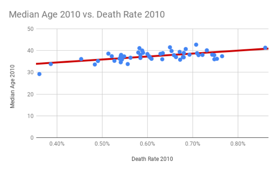
The scatter plot of death rate and median age shows that states with younger populations do tend to have a lower death rate than states with older populations. Of course, since correlation does not imply causation, that doesn’t necessarily mean that if you move to Alaska, you’ll turn younger or live longer.
Q-7: Write a summary of this finding that you can send out to your teammates. Keep it brief and non-technical, but refer to important findings.
Answering questions relating different variables and trying to explain variation often involves bringing together information from different sources. VLOOKUP is a great tool for joining data, but it’s not the only one. In the next few weeks of this course you’ll learn about other ways to join data that are more flexible and that work for much larger datasets.
Example: Cause of Death over Time
One possible explanation for the increase in the number of deaths due to cancer, unintended injuries and Alzheimer’s disease, is that the population of the USA has increased over the same time period. To rule out population growth as a cause of the increase, you need to look at the percentage of the population that died from each cause over time, rather than the raw numbers of deaths.
Construct a pivot table with “Cause Name” for rows and “Year” for columns. The values are the sums of the number of deaths for each group. As the state population data starts in 2010, add a filter to only display the years 2010 to 2016. To convert the total number of deaths to percentages, divide the number of deaths by the population for each year.
Add a row below showing the population for each year from 2010 to 2016. (There are several ways to do this. One possible solution uses the sum of each column of state populations to get the population for each year.)
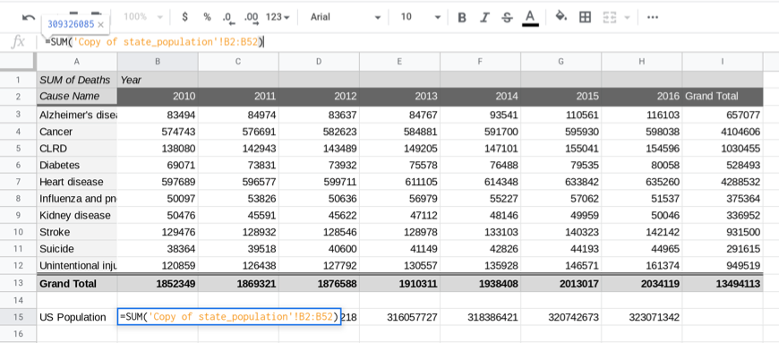
To graph the percentage for each cause of death, construct a table below (or in another sheet) with the same row and column labels. The value of each cell in this table will be the number of deaths for that cause and year divided by the population for that year.
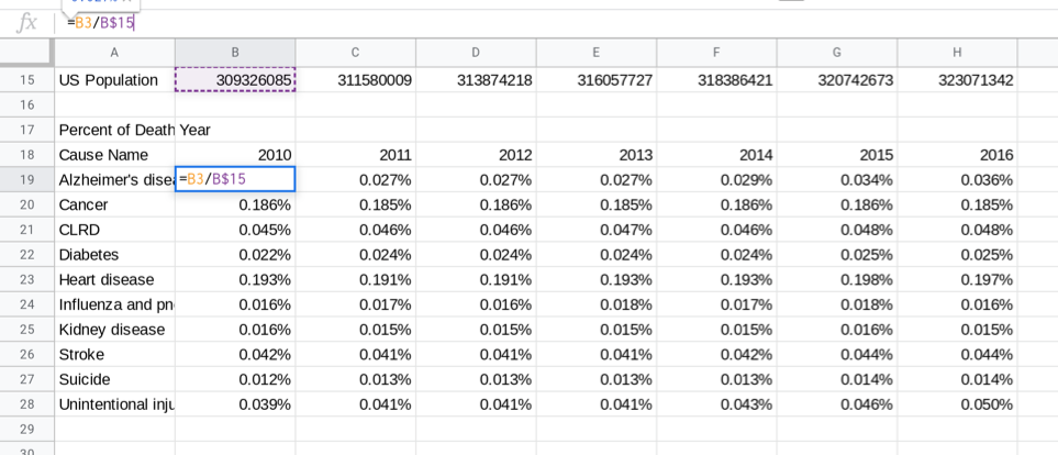
Select the data in this table, A18:H28, and insert a line graph showing how these percentages have changed over time. The graph below has been restricted to cancer, Alzheimer’s disease and unintentional injury for clarity. The line types have also been modified to be dashed in different ways.
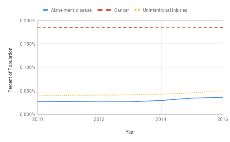
Though the cancer rate is consistent over time, the rates for Alzheimer’s disease and unintentional injury have increased between 2010 and 2016. The Center for Disease Control and Prevention tracks these changes and studies the causes of these increases very closely. The CDC’s research suggests that the number of Alzheimer’s related deaths has been increasing because the US population is getting older and Alzheimer’s is a disease that mostly affects older adults. Additionally, there has been an increase in physicians recording Alzheimer’s as the cause of death. The rate of unintentional injury has also increased, due to increases in fatal car accidents, drug overdose deaths, and fatal falls.