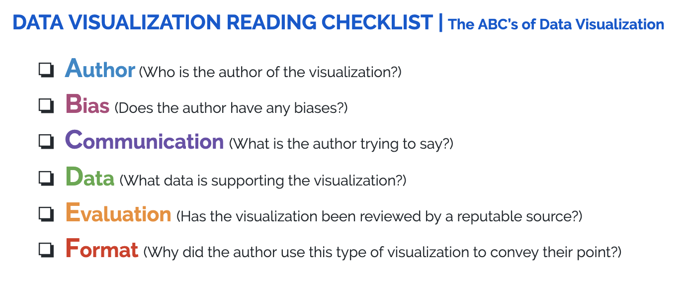
Checklist for Reading Visualizations
What should I look for when reading a visualization?
When you find a visualization online, it is important to ensure that you understand where the data is coming from and how this may affect how it is presented. Being able to interpret visualizations is a fundamental skill in data science. Like any form of media, a visualization has an author. As such, it has potential biases, and can be interpreted in different ways.
Here is a checklist of important things to consider when reading a visualization. More detailed descriptions of what to look for in a visualization are listed below the checklist.

Who is the author of the visualization?
Is the author a single person, or is the author writing on behalf of an organization?
Is the author an experienced statistician and/or writer?
What biases might the author have?
Especially if the visualization is on a media platform, it may have unconscious or conscious bias. This may include, but is not limited to:
political bias
racial bias
product bias (i.e. if the author trying to promote/sell something)
What point is the author trying to communicate with the visualization?
A visualization is an author’s choice of medium to convey facts and/or opinions.
What are these core facts and/or opinions?
What data is backing the visualization?
It is crucial to know what data is used to make the visualization. For example:
Location: Is it global data, or is it a specific country/state/region?
Demographic: Is it a subset of people, specified by something like (but not limited to) race/gender/age?
Sampling: Does it include all of the people in a given population, or just a sample? Is the sample random? How was the sample chosen? (For example, if you were conducting a study of students at your college, your population of interest would be all students at the college, while a sample would be just the students in your dorm.)
How rigorously has the visualization (or the article in which the visualization appears) been reviewed and evaluated?
For example, if the visualization appears in The New York Times it has likely been thoroughly reviewed, whereas if the visualization is part of a personal blog it may not have been.
Why has the author chosen this format of visualization?
What format does the visualization use? Is it a table? Is it a pie chart?
What does this type of visualization do to accentuate their point?
Q-1: Find an example of a data visualization online. Follow the checklist above with your chosen visualization.