Are these data likely to be representative of birth weights for all 3,638,436 U.S. births in 2024? Explain.
Section 6.1 Investigation 2.1: Birth Weights
The CDC’s Vital Statistics Online Data Portal allows you to download birth records for all births in the U.S. in a particular year.
-
Open this website and follow the Downloadable Data Files link for Birth. How large is the zip file for the U.S. data in 2024?
-
Open the User’s Guide for 2024. How many births were recorded for the U.S. in 2024?
-
According to this documentation file, how many total "positions" are there in the data file? What information is in the first 8 positions? What information is in the next 4 positions? How would you determine the birth month?
The file USbirthsJan2024.txt contains information on the 297,798 births in January 2024, including birth weight (in grams), whether the baby was full term (gestation over 36 weeks), the 5 minute apgar score (an immediate measure of the infant’s health), and the amount of weight gained by the mother during pregnancy (in lbs). The goal of this investigation is to build a model of how birth weights can be expected to behave in the future. In particular, we will ask questions such as: Can we use that model to make predictions about certain kinds of birth weights? How reliable will our estimates be?
Discussion: If you were to download this file, it could take a minute. You would then need to unzip the file, which is then 5GB. This can be problematic to work with, especially if you were most interested in just a few of the variables. It can also be cumbersome to deal with all of the rows, especially if you just want to see general patterns. Most packages can now work with datafiles this large, but we are still pushing the limit a bit. JMP and R take a couple minutes to read in the data, and each row is still a single string (not separated into columns or tabs). One approach is to preprocess the data a bit before loading into the software package. Using a program like "awk" you can read in the data from specific positions (e.g., just the birth weights) or in R use read.fwf. Then a comma or tab delimited file would be much easier for the software to handle. Guide for recreating the 2023 datafile.
Exploring the Data.
Checkpoint 6.1.1. Representativeness of data.
Checkpoint 6.1.2. Variable type.
Is the variable birthweight quantitative or categorical?
- Quantitative
- Correct! Birth weight is measured in grams, making it a numerical (quantitative) variable.
- Categorical
- Not quite. Birth weight is a numerical measurement in grams, not a category.
Our next step is to look at the data! As in Chapter 1, we will want to consider which graphical and numerical summaries reveal the most information about the distribution.
Technology Detour - Accessing Quantitative Data.
See the Loading Data - RStudio for instructions on how to load data into your software. You may be able to copy and paste from the webpage, or download the file to your computer and open as tab delimited. Remember to search the help menus for more information if you have more complicated data files in the future.
Aside: R Notes.
Aside: JMP Notes.
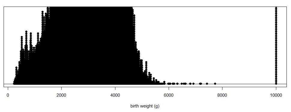
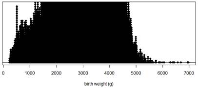
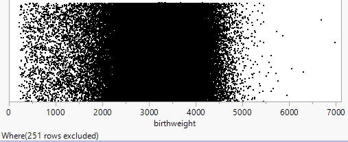
Access the data file and check that you have 297,798 rows of data. Now use technology to create a dotplot of the birth weights.
Technology Detour – Dotplots.
Checkpoint 6.1.3. Creating Dotplots in R.
Assuming you imported the data into "births"
nrow(births)           # Counts the number of observations
names(births)          # Shows the variable names for your data
iscamdotplot(births$birthweight,     # Use file name $ variable name
  xlab="birth weight (g)",           # Can add nicer horizontal axis label
  main="graph of birthwt")           # Can add title
Checkpoint 6.1.4. Creating Dotplots in JMP.
-
Select Graph > Graph Builder
-
Drag the birthweight variable from the list on the left to the X label.
-
Select the far left graph type that is only dots.
-
Use the pull-down menu to change the Jitter style to Positive Grid.

A dotplot shows each numerical value individually (and is best with smaller datasets), some packages may actually "bin" the values if the data set is large. If the dataset includes many distinct (non-repeated) values, this can make it more difficult to see the "clumping" in the data.
Checkpoint 6.1.5. Describe dotplot.
Describe what you see.
Discussion: Handling Missing Data.
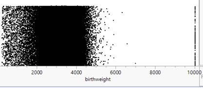
Discussion: The observations at 9999 don’t seem to belong. The User Guide or "codebook" for these data states that the largest birth weight is 8165 grams and for other variables it lists 99, 999, or 9999 as values for "not stated" or unknown.

You could convert these observations to the missing value designator in your software or you can create a new data set that does not include those rows (subsetting the data).
Aside: R Note.
Aside: JMP Note.
Technology Detour – Subsetting the Data.
Checkpoint 6.1.6. Subsetting Data in R.
births2 = births[which(births$birthweight < 9999), ]  # selects rows that satisfy condition
                                                         # notice the comma!
nrow(births2)
# Refer to the new data using births2$birthweight
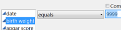
Checkpoint 6.1.7. Subsetting Data in JMP.
-
Use the Rows menu to select Row Selection > Select Where
-
Specify you want to select the rows where birth weight is equals 9999
-
Press OK.
-
Then select Rows > Hide and Exclude
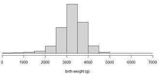
Checkpoint 6.1.8. Recreate dotplot with subsetted data.
Recreate the dotplot with the subsetted data and describe what you see.
Hint 1. R Output
Hint 2. JMP Output
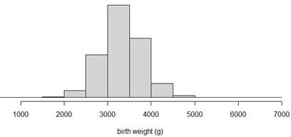
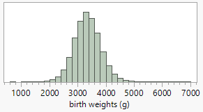
Using Histograms.
It may still be difficult to see much in the dotplot with such a large data set, especially if there are many distinct (non-repeated) values. One solution is to "bin" the observations. Some software packages (e.g., Minitab) will do that automatically even with a dotplot. Another approach is to use a different type of graph, a histogram, that groups the data into intervals of equal width (e.g., 1000-2000, 2000-3000, …) and then construct a bar for each interval with the height of the bar representing the number or proportion of observations in that interval. Notice these bars will be touching, unlike in a bar graph, to represent the continuous rather than categorical nature of the data.
Technology Detour – Histograms.
Checkpoint 6.1.9. Creating Histograms in R.
hist(births2$birthweight, xlab="birth weight")
# Note you can also use breaks=x to change the number of intervals to x.
Checkpoint 6.1.10. Creating Histograms in JMP.
-
Choose Analyze > Distribution
-
Drag birth weight to the Y, Columns box (or click on it and press the button)
-
Click OK.
-
Use the hot spot and choose Histogram Options > Vertical (to unselect).
-
Right click on one of the values and select Add Axis Label and enter the variable description.
-
See File > Preferences to change some of the default settings

Checkpoint 6.1.11. Compare dotplot and histogram.
Create a histogram for the subsetted data (births2) and compare the information revealed by the dotplots and the histograms. Do you feel one display is more effective at displaying information about birth weights than the other? Explain.
Hint 1. R Output
Hint 2. JMP Output
Describing Distributions of Quantitative Data.
In describing the distribution of quantitative data, there are three main features:
-
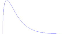
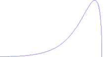
Shape: What is the pattern to the distribution? Is it symmetric or skewed? Is it unimodal or is there more than one main peak/cluster? Are there any individual observations that stand out/don’t follow the overall pattern? If so, investigate these "outliers" and see whether you can explain why they are there.
-
Center: Where is the distribution centered or clustered? What are typical values?
-
Variability: How spread out is the distribution? How far do the observations tend to fall from the middle of the distribution? What is the overall range (max – min) of the distribution?
It is also very important to note any observations that do not follow the overall pattern (e.g., "outliers") as they may reveal errors in the data or other important features to pay attention to.
Checkpoint 6.1.12. Characterize the distribution.
How would you characterize the shape, center, and variability of these birthweights? (Remember to put your comments in context, e.g., "The distribution of January birthweights in 2024 was …")
Checkpoint 6.1.13. Explain lower weight babies.
You may have noticed a few more lower weight babies than we might have expected (if we assume a "random" biological characteristic will be fairly symmetric and bell-shaped). Can you suggest an explanation for the excess of lower birth weights seen in this distribution?
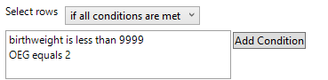
Checkpoint 6.1.14. Subset by gestation period.
Now, further subset the births2 data based on whether or not the pregnancy lasted at least 37 weeks. How many observations do you end up with?
Hint. R Hints
Checkpoint 6.1.15. Assess symmetry after subsetting.
Numerical Summaries.
Let’s use this as our final dataset and use technology to calculate some helpful numerical summaries of the distribution, namely ones that describe the center (e.g., mean, median), variability (e.g., standard deviation), and skewness. The skewness statistic involves \(\Sigma((y_i-\bar{y})/s)^3\text{,}\) so positive values indicate a distribution that is skewed right, negative values indicate a distribution that is skewed left, and values near zero indicate a symmetric distribution.
Technology Detour – Numerical Summaries.
Checkpoint 6.1.16. Numerical Summaries in R.
R note: This is our final dataset, so we can "attach" the datafile and then not need to use "births3$" for R to know which dataset we are using.
attach(births3) # Optional step if this is final data to work with
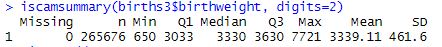
iscamsummary(births3$birthweight, digits=2)
# Entering "digits = " specifies the number of digits you want displayed
# after the decimal. Default is 3.
Checkpoint 6.1.17. Numerical Summaries in JMP.
See the Analyze > Distribution output from creating the histogram and/or Analyze > Tabulate.
Checkpoint 6.1.18. Report numerical summaries.
Checkpoint 6.1.19. Interpret numerical summaries.
Interpret the mean, standard deviation, and skewness values in context.
Checkpoint 6.1.20. Effect of outliers.
How would the mean and standard deviations values compare if we had not removed the 9999 and low birthweight values?
Fitting a Model.
Recall from Chapter 1 the normal probability distribution has some very nice properties and allows us to predict the behavior of our variable. For example, we might want to assume birth weights follow a normal distribution and estimate how often a baby will be of low birth weight (under 2500 grams according to the International Statistical Classification of Diseases, 10th revision, World Health Organization, 2011) based on these data.
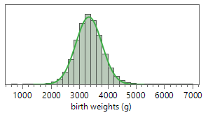
Checkpoint 6.1.21. Assess normality.
Do these birth weight data appear to behave like a normal distribution? How are you deciding?
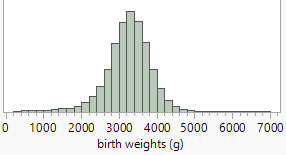
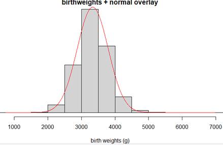
Technology Detour – Normal Distribution Overlay.
Many software programs will allow you to overlay a theoretical normal distribution to see how well it matches your data, using the mean and standard deviation from the observed data.
Checkpoint 6.1.22. Add Normal Overlay in R.
Add an overlay of a normal model on the distribution of birthweight data. (First create the histogram as above.)
iscamaddnorm(births3$birthweight, main, xlab, bins)
Checkpoint 6.1.23. Add Normal Overlay in JMP.
Add an overlay of a normal model on the distribution of birthweight data.
Use the hot spot and select Continuous Fit > Normal.
Checkpoint 6.1.24. Assess normal overlay fit.
Discuss any deviations from the pattern of a normal distribution.
Technology Detour – Checking Normal Distribution Properties.
Another method for comparing your data to a theoretical normal distribution is to see whether certain properties of a normal distribution hold true. In Chapter 1, you learned that 95% of observations in a normal distribution should fall within two standard deviations of the mean.
Checkpoint 6.1.25. Calculate Percentage Within 2 SD in R.
Calculate the percentage of the birthweights that fall within 2 standard deviations of the mean by creating a Boolean (true/false) variable.
within2sd = (birthweight > mean(birthweight) - 2*sd(birthweight)) &
            (birthweight < mean(birthweight) + 2*sd(birthweight))
# Note: Make sure you copy this code with no line breaks (and assumes data is attached)
table(within2sd)/length(birthweight)
Checkpoint 6.1.26. Calculate Percentage Within 2 SD in JMP.
Calculate the percentage of the birthweights that fall within 2 standard deviations of the mean.
-
Calculate (by hand) the mean + 2SD limits (e.g., 2415 and 4258).
-
In the data window, double click on an empty column to activate it and name it "within2sd"
-
Right click on the column name and select Formula
-
From Functions (grouped) select Conditional. Enter conditions for birth weight < 4258 & birth weight > 2415 to equal 1, 0 otherwise.
-
Then use Analyze > Distribution on this column and report the mean, the proportion of ones.
Checkpoint 6.1.27. Percentage within 2 SD.
Solution.
Checkpoint 6.1.28. Compare to normal prediction.
How well does this percentage match to what would be predicted if the data were behaving like a normal distribution?
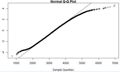
Technology Detour – Normal Probability Plots.
Another way to assess the "fit" of a probability model to the data is with a probability plot (aka quantile plot). Probability plots work roughly like this: The computer determines how many observations are in the data set, and then reports the z-scores it would expect for the 1/nth percentiles (also called quantiles) for the probability model. The plot compares these z-scores to the observed data; if the z-scores "line up" with the observed data, then the probability plot supports that the data are behaving like the candidate distribution. The theory is that whether or not the observations follow a line can be easier to judge than whether a histogram follows a curve.
Checkpoint 6.1.29. Create Normal Probability Plot in R.
Use technology to create a normal probability plot for the subsetted birth weight data.
qqnorm(birthweight, datax=TRUE)    # "datax=T" puts observed values on x-axis
qqline(birthweight, datax=T)
Checkpoint 6.1.30. Create Normal Probability Plot in JMP.
Use technology to create a normal probability plot for the subsetted birth weight data.
In the Distributions window, Use the hot spot to select Normal Quantile Plot.
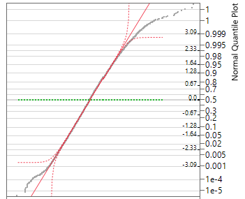
Checkpoint 6.1.31. Assess normal probability plot.
Do the observations deviate much from a line? If so how?
Hint.
Discussion: Some software packages report a p-value with the normal probability plot. The null hypothesis here is that the data do follow a normal distribution, so if you fail to reject this null hypothesis you can say that the data do not provide strong evidence that they do not arise from a normally distributed population. (But keep in mind that large sample sizes will drive the p-value down, regardless of the actual shape of the population.) There are several different types of significance tests for normality, but in this text, we will focus on the visual judgement of whether the probability plot appears to follow a straight line.
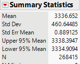
Suppose we were willing to assume that in general birth weights are approximately normally distributed with mean 3339 grams and standard deviation 462 grams. We can use this model to make predictions, like how often a baby will be of low birth weight, defined as 2500 grams or less.
Checkpoint 6.1.32. Calculate low birth weight probability.
Use technology (e.g., Normal Probability Calculator applet) to calculate the normal distribution probability that a randomly selected baby will be of low birth weight. Include a well-labeled sketch with the shaded area of interest.
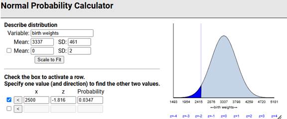
Checkpoint 6.1.33. Compare to actual data.
Now examine the births3 data: What percentage of the birth weights in this data set were at most 2500 grams? [Hint: Create a Boolean variable?] How does this compare to the prediction in the previous checkpoint? Does this surprise you? Explain.

Solution.
In this sample, 3.2% of the full term babies were of low birth weight. Using the normal distribution very slightly overpredicted how often this would happen. We might have expected the normal distribution to underpredict based on the heavier tails in the sample we saw earlier, though it is less about the percentage "out there" and more about how far out there based on 95% of the distribution falling within 2SD but still seeing the heavier tails in the normal probability plot.
Discussion: We can often use a theoretical model to predict how data will behave. However, it is often unclear whether the model we are using is appropriate. Sometimes we have to consider the context (e.g., biological characteristic) and presume a particular model. We can also use existing data to create a model but we need to consider what population the data are representative of and how stable we think the data generating process is (e.g., not changing over time). In this case, a normal distribution appears to underestimate the likelihood of both smaller and heavier babies (3.2% beyond 2SD rather than 5%), but overall the model is performing well, allowing us to make predictions like we did in (r).
Subsection 6.1.1 Practice Problem 2.1A
The data in MLB_FCI_22.txt, compiled by Team Marketing Report, includes various costs for attending a Major League Baseball game in the 2022 season. The "Fan Cost Index" is defined as the price of a family of four to attend a game, assuming 4 adult average-price tickets, parking for one car, and the cheapest (at that park) price for two draft beers, four soft drinks, four hot dogs, and two caps.
Note: Make sure the columns parse correctly (e.g., Data > Text to Columns in Excel?) and remove the last row before you start analyzing the data.
Checkpoint 6.1.34. Compare dotplot and histogram.
Create and include a dotplot and a histogram of the FCI values. Which graph do you prefer? Why?
Checkpoint 6.1.35. Assess normality with probability plot.
Create and include a normal probability plot of the FCI values. What do you conclude from this graph? Explain your reasoning.
Checkpoint 6.1.36. Analyze FCIPctChange distribution.
Create and include a dotplot of the FCIPctChange values which represent the percentage change in the FCI values from the previous year. Also report and summarize what you learn from the median.
Checkpoint 6.1.37. Identify outlier team.
The distribution of the FCIPctChange values shows a low visual outlier. Identify this team by name. What is special about this team?
Checkpoint 6.1.38. Identify unusual cap price.
Examine and include a stemplot of the cap prices. We see one team with an unusual value. Identify this team by name and suggest an explanation for its unusual cap price.
Subsection 6.1.2 Practice Problem 2.1B
The AnthemTimes2025.txt file has data on the length of the performance of the national anthem preceding the National Football League’s Super Bowl for games from 1980 (Super Bowl 14) to 2025 (Super Bowl 58). Note: There are two columns for times (the first is from a colleague of mine watching and timing each one, the second one is from sportsbettingdime). Using sbdTime:
Checkpoint 6.1.39. Create dotplot with active title.
Create and include a well-labeled dotplot of the performance lengths. Include an "active title."
Checkpoint 6.1.40. Describe distribution.
Give a brief description, in context, of the distribution, as if to someone who can’t see your graph.
Checkpoint 6.1.41. Create boxplot and identify outliers.
Create and include a modified boxplot of the performance lengths. Identify any outliers shown in the boxplot by name.
Checkpoint 6.1.42. Report summary statistics.
Report the mean, median, and standard deviation. Include measurement units.
Checkpoint 6.1.43. Predict next Super Bowl length.
Give one number to predict the performance length in the next Super Bowl. Also include some indication of how accurate you think your prediction will be. (Cite any external information/additional analysis that you use.)
Subsection 6.1.3 Practice Problem 2.1C
Checkpoint 6.1.44. Generate random normal data and create probability plot.
Use statistical software to generate a random sample of 100 observations from a normal distribution with mean 2 and standard deviation 5. Create a normal probability plot of the generated data. Do the data follow a straight line?
Checkpoint 6.1.45. Generate skewed data and compare probability plot.
Repeat the previous question for data that are skewed to the right. How does the behavior of the probability plot change? How would you interpret this plot without looking at the histogram?
You have attempted of activities on this page.
